seabornを使ってみた ヒートマップを描画する
元データをピボット処理してヒートマップに描画する例。
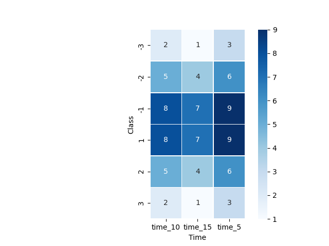
ヒートマップの際の並べ替え指定が面倒なので、昇順に並べればよいような行/列名にしておいたほうがよさそう。
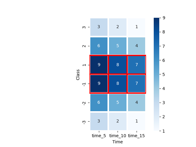
各列の最大値に対して、強調枠を設定。枠の場所の指定方法が、dfの並びと同様、左上がゼロ。位置関係の取得はループで回している。
ソース
import pandas as pd
import seaborn as sns

import matplotlib.pyplot as plt
import os

time_5 ='time_5'
time_10 ='time_10'
time_15 = 'time_15'

list_2d =[[time_5,1,9],
[time_5,2,6],
[time_5,3,3],
[time_5,-1,9],
[time_5,-2,6],
[time_5,-3,3],
[time_10,1,8],
[time_10,2,5],
[time_10,3,2],
[time_10,-1,8],
[time_10,-2,5],
[time_10,-3,2],
[time_15,1,7],
[time_15,2,4],
[time_15,3,1],
[time_15,-1,7],
[time_15,-2,4],
[time_15, -3, 1]]

df = pd.DataFrame(list_2d,columns=['Time', 'Class', 'Score'])
print(df)
#       Time  Class  Score
#0    time_5      1      9
#1    time_5      2      6
#2    time_5      3      3
#3    time_5     -1      9
#4    time_5     -2      6
#5    time_5     -3      3
#6   time_10      1      8
#7   time_10      2      5
#8   time_10      3      2
#9   time_10     -1      8
#10  time_10     -2      5
#11  time_10     -3      2
#12  time_15      1      7
#13  time_15      2      4
#14  time_15      3      1
#15  time_15     -1      7
#16  time_15     -2      4
#17  time_15     -3      1

print(df.pivot(index='Time', columns='Class', values='Score'))
# Class    -3  -2  -1   1   2   3
# Time
# time_10   2   5   8   8   5   2
# time_15   1   4   7   7   4   1
# time_5    3   6   9   9   6   3


pivot = df.pivot(index='Class', columns='Time', values='Score')

print("ピボットの順番並べ替え")
pivot = pivot.sort_index(axis=0, ascending=False, inplace=False)
pivot = pivot.loc[:, ['time_5', 'time_10', 'time_15']]

print(pivot)

sns.heatmap(pivot, cmap='Blues', annot=True, fmt='d', linewidths=.5,square=True)

# plt.show()では、次のエラーになる
# 'AxesSubplot' object has no attribute 'show'
# import matplotlib.pyplot as plt が必要。

# snsからpltへの間のデータの受け渡しがどうなっているのか未確認。
plt.show(block=False)

# ファイルに保存
img_file_name= os.path.dirname(os.path.abspath(__file__)) + os.sep + "heatmap.png"
plt.savefig(img_file_name)

# 各列、最大値に対して強調表示
for col_index,col_index_name in enumerate(pivot.columns.values):
    max_val= pivot[col_index_name].max()
    for row_index, row_value in enumerate(pivot[col_index_name] == max_val):
        if row_value==True:
        # Rectangleは、左上が(0,0)
            ax.add_patch(Rectangle((col_index, row_index), 1, 1, fill=False, edgecolor='red', lw=3))

plt.show(block=False)
img_file_name= os.path.dirname(os.path.abspath(__file__)) + os.sep + "heatmap_w_patch_loc.png"
plt.savefig(img_file_name)
結果
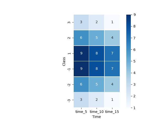
並べ替えをしなかった場合
各列の最大値に対して強調枠設定